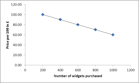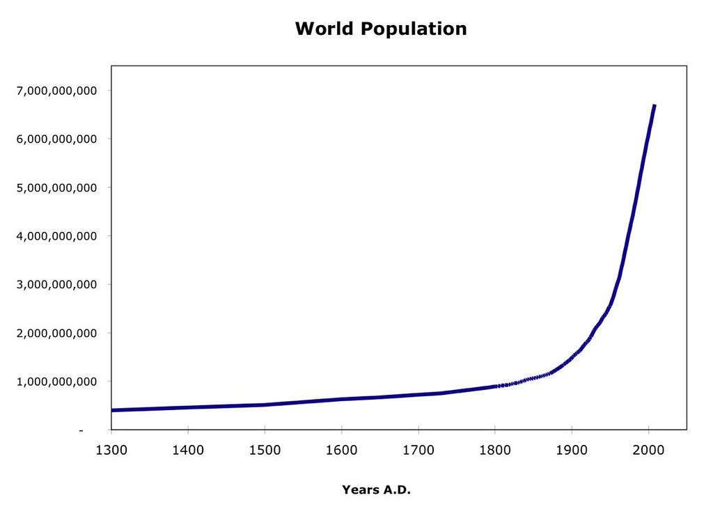
A cropped chart is a persuasive object. It arrives already framed: a bold line, a dramatic label, maybe an arrow added by someone who wants you to feel urgency before you ask what is being counted. The crop may be innocent. It may also remove the axis, the source, the time period, or the boring comparison that would make the claim less exciting.
This checklist is for the moment before you share. It is not asking you to become a statistician. It is asking you to slow the number down.
The Pre-Share Checklist
- What is the original source, and can I find it without relying on the screenshot?
- What exactly is being counted?
- What is the denominator: out of whom, out of what, or out of which cases?
- Who is in the sample, and who is missing?
- What time period does the statistic cover?
- What is the comparison group?
- Is uncertainty shown or hidden?
- Does the statistic describe correlation, or is someone implying causation?
- Does the chart design change the emotional meaning?
- Would I phrase the claim the same way if the number supported the opposite side?
If any of these questions cannot be answered, the statistic may still be useful. But it should be shared with caution, context, or not at all.
1. Find the Source Before Trusting the Crop
“Source: survey” is not enough. A useful source trail tells you who collected the data, when, with what method, and for what purpose. Public statistical offices, recurring social surveys, peer-reviewed research, transparent nonprofit evaluations, and well-documented administrative datasets can all be credible. Each still has limits.
Look for the original table, report, methods note, or data release. If the number appears only in a social media image, campaign graphic, or opinion article, treat it as unverified until you can trace it back. If you cannot find the original, say that plainly or do not share it.
Source quality is not only about reputation. A trusted institution can answer a narrow question well and a broader question badly. A small community survey can be honest and useful for local learning while not supporting national claims. The right question is: is this source fit for the claim being made?
2. Ask What Is Being Counted
Many arguments begin with a noun that sounds obvious: migrants, households, incidents, unemployed people, volunteers, complaints, young people, poverty, hate speech. In data, none of these nouns is automatic.
Germany’s Mikrozensus categories, for example, may define migration background in a particular way. Administrative systems may count registered cases, not lived experiences. Police statistics count recorded offences, not all harm. A housing platform may count listings, not available homes in practice. A school may count formal complaints, not all experiences of exclusion.
Before sharing, translate the number into a full sentence: “This counts people who…” or “This counts cases recorded by…” If you cannot complete that sentence, you do not yet know what the statistic says.
3. Check the Denominator
A numerator is the visible number. The denominator is what it is divided by. Without the denominator, many statistics become theatre.
“More complaints were filed” can mean harm increased, awareness increased, reporting became easier, an office changed its categories, or the population covered by the office grew. “Most participants improved” sounds strong until you ask: out of all participants, out of those who completed the survey, or out of those who stayed until the end?
Denominators matter in civil-society work because the people most affected by a problem may be least likely to appear in the final count. If a program reports outcomes only for people who finished every session, it may miss those pushed out by shift work, childcare, disability access, language barriers, or transport cost.
4. Inspect the Sample
A sample is the group from whom data was collected. It may be random, recruited through a panel, drawn from service users, collected through an online form, or gathered at an event. None of these is automatically wrong. Each supports different claims.
A survey of newsletter subscribers can tell an organization something about its reachable public. It cannot tell Germany what “people think.” A voluntary online poll may reveal intensity among people who care enough to click. It cannot estimate population prevalence. A qualitative interview study can explain experiences in depth. It should not be treated as a headcount.
Ask who could realistically be included. People without stable housing, people with limited German literacy, people avoiding institutions, undocumented people, shift workers, children, older people offline, and disabled people facing inaccessible formats are often underrepresented unless the design actively includes them.
5. Locate the Time Period
Numbers have calendars. A statistic from a crisis year may not describe the current situation. A monthly figure may be noisy. A yearly average may hide a short but severe spike. A comparison across years may be distorted if definitions changed.
The time period should match the claim. If someone uses a single month to describe a long-term trend, be careful. If someone uses a long-term average to dismiss a recent worsening, be equally careful. In German administrative contexts, policy changes, reporting rules, school years, and benefit procedures can all change what a number captures.
Before sharing, add time words to the claim: “in this survey period,” “among recorded cases in that year,” “during the months covered by the report.” Time words reduce overclaiming.
6. Demand the Comparison Group
A number without comparison often invites your imagination to supply one. “A large share” compared with what? “Rising” since when? “Higher risk” than whom? “Successful program” relative to what would likely have happened without it?
Comparison groups can be simple: this year versus previous years, one district versus similar districts, participants versus eligible nonparticipants, survey respondents with different housing situations. The important point is that the comparison must be relevant.
Bad comparisons are common. Comparing a city with many students to a rural district may say more about age structure than policy. Comparing program graduates with all applicants may say more about who was able to stay. Comparing recorded hate incidents between countries may say more about reporting systems than social attitudes.
7. Look for Uncertainty
Many published numbers are estimates, not exact measurements. Surveys usually have sampling uncertainty. Small subgroups can produce unstable percentages. Administrative data can contain missing entries or classification changes. Evaluation findings can be suggestive without being definitive.
Responsible communication does not need to bury readers in technical intervals. It should avoid false precision. Phrases like “the data suggests,” “in this sample,” “roughly,” “reported more often,” or “the direction is clearer than the exact size” can be more accurate than a confident headline.
If a chart shows tiny differences but no uncertainty, ask whether the difference may be noise. If a claim depends on ranking groups with very similar values, ask whether that ranking is meaningful.
8. Separate Correlation From Cause
Two things can move together without one causing the other. A neighbourhood with more civic associations may also have higher reported trust. That does not prove associations created the trust. Perhaps high trust made associations easier to build. Perhaps income, stable housing, or local history shaped both.
This does not make correlations useless. They are often the beginning of good questions. They can show patterns worth investigating, groups needing attention, or places where more careful evaluation is justified. But sharing a correlation as proof of cause is one of the quickest ways to turn evidence into misinformation.
For program claims, ask: what would likely have happened without the program? If there is no comparison, the evidence may still support learning, but it cannot carry a strong causal claim.
9. Watch the Chart Tricks
Charts communicate through shape before text. A shortened vertical axis can make a modest change look dramatic. A very wide time axis can make movement look flat. Unequal intervals can distort pace. A pie chart with too many slices can obscure differences. A map can make land area look like population weight. Colour choices can imply danger, success, or hierarchy before the reader sees the method.
Cropping is especially powerful. A screenshot may remove earlier years, neighbouring categories, caveats, or the note that the measure changed. If the visual feels designed to end the conversation, reopen it by looking for the missing frame.
Technically correct charts can still mislead when design choices exaggerate certainty, hide denominators, or invite the wrong comparison.
10. Decide How to Share, Not Just Whether
Sometimes the responsible choice is to share the statistic with context. Sometimes it is to share the source instead of the screenshot. Sometimes it is to say, “This number is being used too strongly.” Sometimes it is to not amplify it.
If platform misinformation, harassment, or digital sharing dynamics are the main problem, Digital Dignity Lab is the better hand-off. Our concern here is evidence literacy: how to inspect a number before it becomes part of public reasoning.
A trustworthy statistic answers a clear question with a method that fits. A misleading statistic often answers a smaller question than the caption claims. The pre-share discipline is simple: source, count, denominator, sample, time, comparison, uncertainty, cause, chart. If those pieces are visible, you can share more carefully. If they are missing, the missing pieces are part of the story.